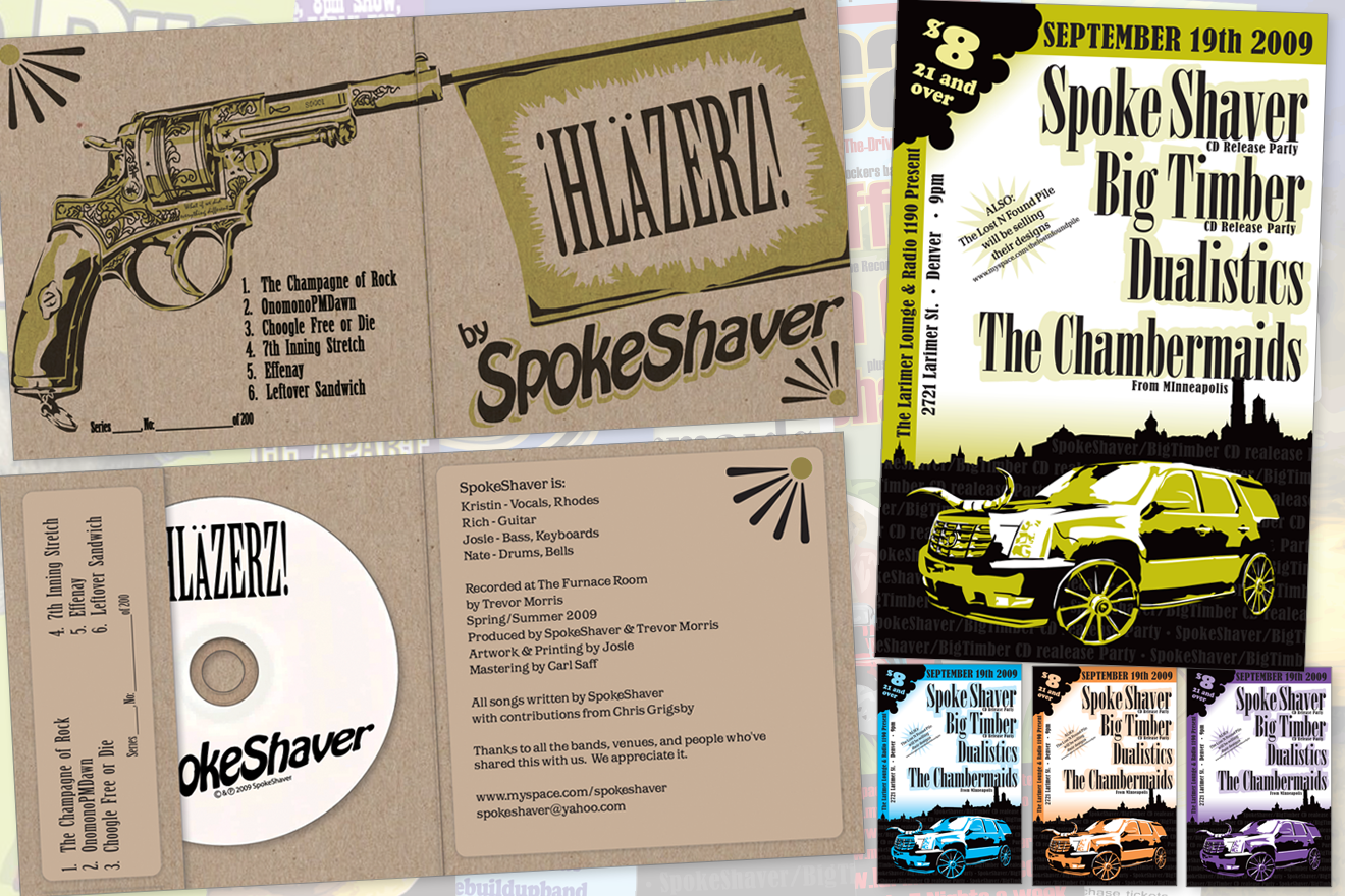
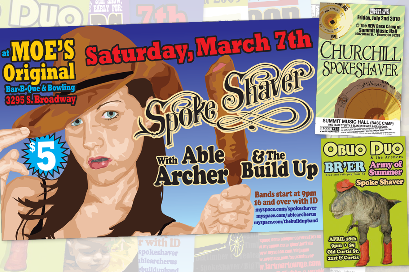
Spokeshaver: CD Packaging and Concert Poster illustration
Oct 2012
Spokeshaver was a 4 piece band I was in from 2008 through 2012. I was one of the original founding members and I played bass and synthesizers in the group, in addition to being the band's artistic director and illustrating all of our concert posters. The style I used for most of the work is a color block digital illustration style inspired by the work of Shepard Fairey and the Russian constructivist style of Vladimir and Georgii Stenberg.
The band played over 20 shows throughout the Denver area and released a single 6 song CD EP, of which The Westoword's Jason Heller said: "Over the past few months, the Denver-based group have confounded local audiences with a dose of wiry, sprawling rock that's complex and catchy at the same time." Acclaimed music journalist Tom Murphy says: "These people have the temerity to claim they're really good, but it's not mere bravado: In an era of classic-rock poseurs, Spoke Shaver is the real thing."
The band played over 20 shows throughout the Denver area and released a single 6 song CD EP, of which The Westoword's Jason Heller said: "Over the past few months, the Denver-based group have confounded local audiences with a dose of wiry, sprawling rock that's complex and catchy at the same time." Acclaimed music journalist Tom Murphy says: "These people have the temerity to claim they're really good, but it's not mere bravado: In an era of classic-rock poseurs, Spoke Shaver is the real thing."