Miscellaneous Identity Design Packages & Collateral

Jan 2016

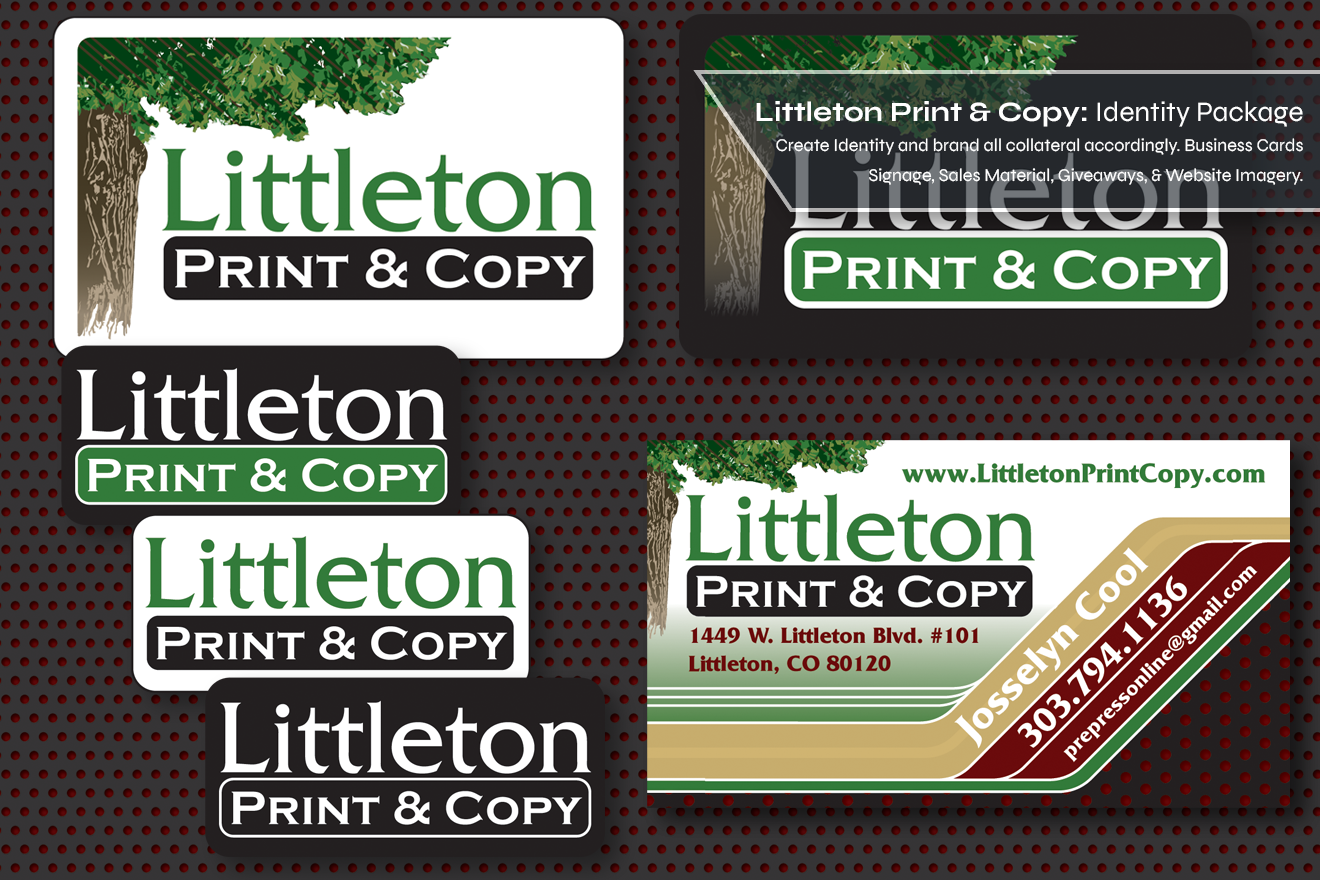
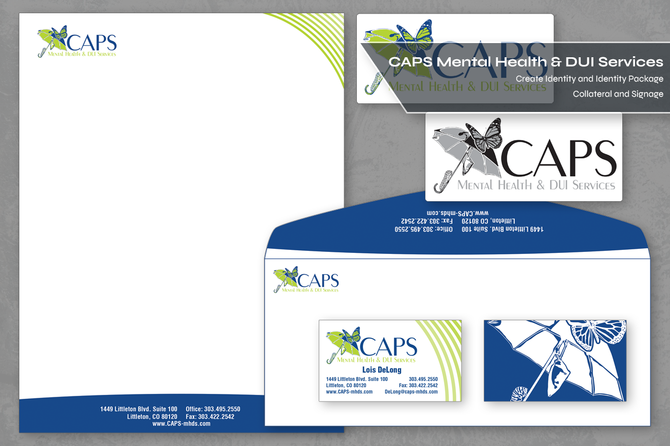
This page contains a collection of identity packages that I created for smaller businesses and friends who didn't need a whole graphic standards package or business paper set built, but needed a logo for their business, nonetheless. One of the main items we offered at Envirofriendly printing was business cards, and in most of these cases, that was the first item we branded for the client. Even though they would come to us with small budgets, I like to think we offered all these companies elevated design quality.
Identity package for K3 Science including a Business Card, One Sheet, and 2 label designs.
Ms. Killick came to us to create(counterclockwise from top right) a logo, Business Cars, a one-sheet on her business, and a couple of product labels for her demonstration products.  She had spent her entire life as a chemical engineer for a local aerospace corporation, so when she told us her tagline was "Beautiful Hair IS Rocket Science," we knew it was not false bravado.  Being that chemistry was such a selling point of her story, I decided to incorporate a molecular chain diagram into both her logo and the associated collateral we created.  She wanted to make sure the products looked soft and feminine so a palate of light pinks and purples was chosen for the corporate colors.
Logo designs for J&J Painting, Colorado Asbestos Consulting LLC, and Lions Granite & Stone
Mr. Kracke was a lifelong house painter who was striking out on his own for the first time in his life.  He was an avid motorcyclist and wanted a logo that both exemplified that he was a painter, but also his love for Harley Davidson motorcycles.  

Colorado Asbestos Consulting wanted a logo that looked reminiscent of "old Colorado" as the owner had been in the city since the 70s. I offered this stylized mountain illustration and it thrilled them.

Lion's Granite and Stone came to me with a clip art style lion's head from the local high school and wanted something in that style for their new business.  I illustrated a stylized lion's head and added a modern typeface to make them appear more contemporary.
logo and sales collateral for Envirocopy.com & Andkom inc.
EnviroCopy was a website I helped create, within Envirofriendly Printing, to sell budget copies to the Denver market with a digital upload front end to alleviate the expense of customer interaction. The Logo was designed to incorporate a natural, “environmental” aspect, as well as the digital front end. The Envirocopy flyer was designed for internet and wholesale customers who were mostly interested in price and details rather than flashy graphics or product images. The flyer was information-heavy to explain the details of the program, but a clear information hierarchy and a simple, clean design help direct your eye through the page.

Andkom came to us as a new B2B company that made organic fertilizer for the lawn and garden industry. The owners came to me asking for a logo that depicted the world in grid form as the flowering part of a plant. They also wanted business cards, labels for their bottles, and labels for their shipping boxes.

logo design for the Denver band SPELLS including a cassette sleeve an a T-shirt design.  A logo design for Blow:A Salon including a business card.
The identity package at left was for the Denver punk band SPELLS for use on t-shirts and a tape release. The band describes itself as “Vacation Rock” because they fly to places they want to visit and play concerts full of fun, upbeat music. I designed the logo to be as quintessentially “vacation-y” as I could with all the things I think of for fun in the sun. The cassette was "minimum effort" so I illustrated a relaxing-looking vintage lawn chair for the double-sided cassingle.

The package at right was created for Blow!, a new salon in the highlands area of Denver. The interior design was very mid-mod inspired, and the customer base was mostly hip 20 and 30 somethings. The salon was unisex and owned by co-ed friends, so we went for a gender neutral design. The modern typeface for “Blow” as well as the silver color gives a more masculine appearance. The script for “a salon” as well as the illustration for the vintage hairdryer gives a softer, more feminine appearance. Since the logo itself is muted in color, I incorporated more stark pops of color in the business card design.

More Projects:
Interested in connecting?
Click here to start a conversation!